creative direction
jewellery carries the words we don't want to lose.
2026
the process.
the starting question
how do you give the British Vogue jewellery supplement an emotional idea, not just a product story?
the concept
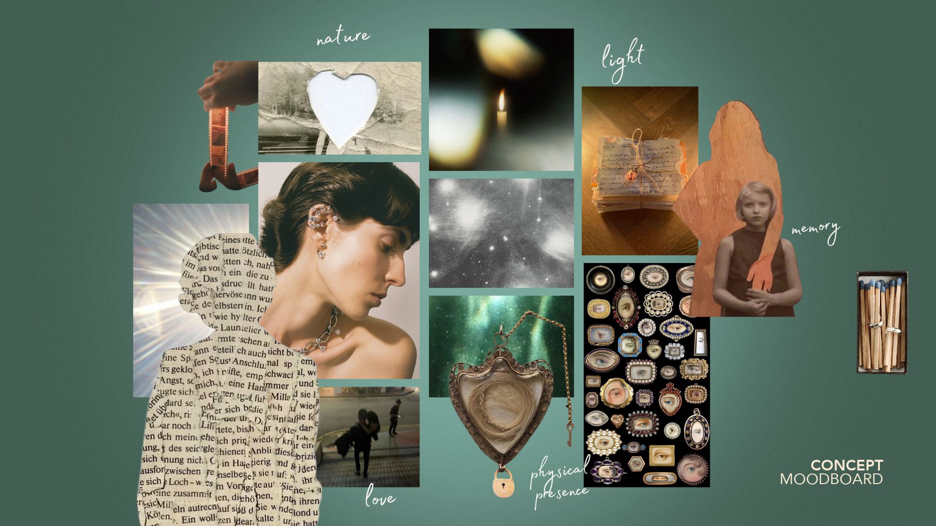
"jewellery carries the words we don't want to lose": from victorian mourning pieces to today's makers, jewellery as a place for invisible feelings.
the process
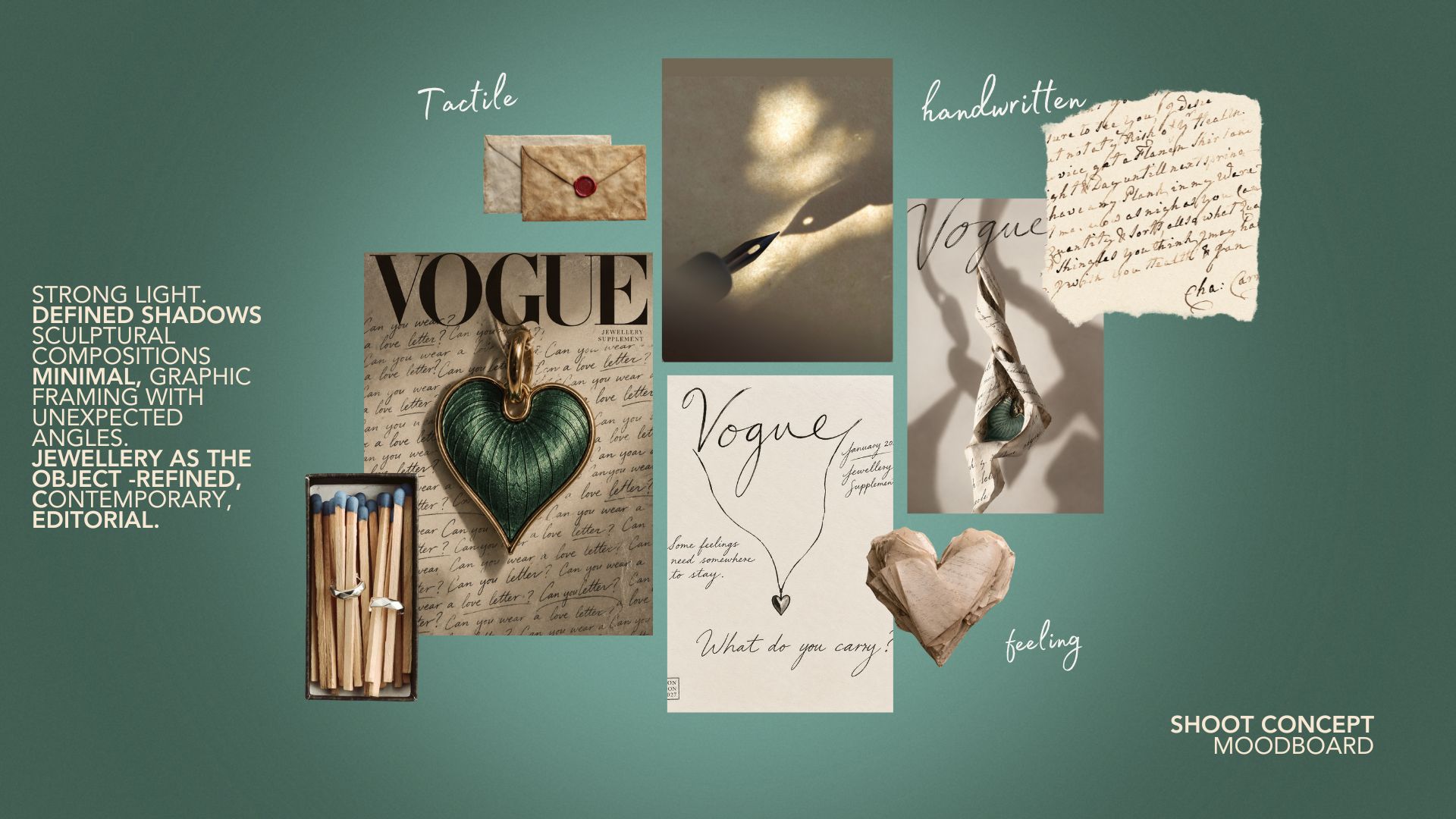
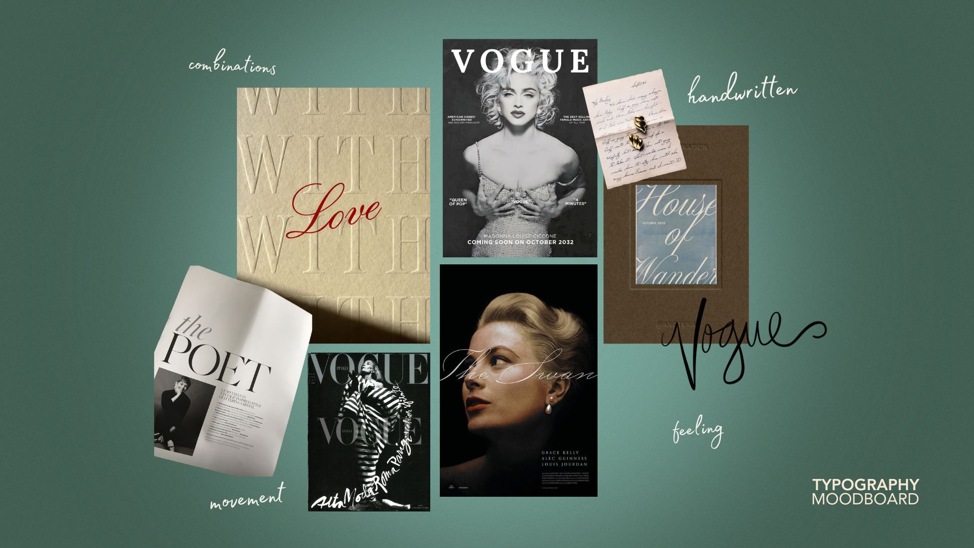
five days at Vogue College of Fashion: moodboards, shoot concept, handwritten typography, and a cover built around a letter that becomes the necklace cord.
my role
creative direction of the concept, cover and supplement, developed in a group.
the result
the cover "a letter to carry", a supplement plan and the living archive, a digital space for readers' jewellery stories.
This was the creative challenge for the 5 days Creative Direction at Vogue College of Fashion. We developed a concept for the jewellery supplement.
JEWELLERY CARRIES THE WORDS WE DON’T WANT TO LOSE.
It is intimate to put a feeling into words. Before we write them, we have to think about what we feel, who we want to say it to, and what is worth keeping.
Jewellery has always given invisible things somewhere to stay. From Victorian mourning jewellery, carrying miniature portraits, locks of hair and memories of those we loved, to contemporary designers creating pieces that hold personal stories, jewellery has been a vessel for human experience.
This January, British Vogue celebrates the pieces we inherit, collect and eventually pass on. Alongside an history of the craft, the supplement will spotlight a new generation of jewellers pushing the language of the craft through sculptural forms, unexpected materials and experimental approaches
At its heart is the Living Archive: a digital space where readers can be part of a collective portrait of jewellery emotions.
Because jewellery is not simply what we wear. It is what we choose to carry.
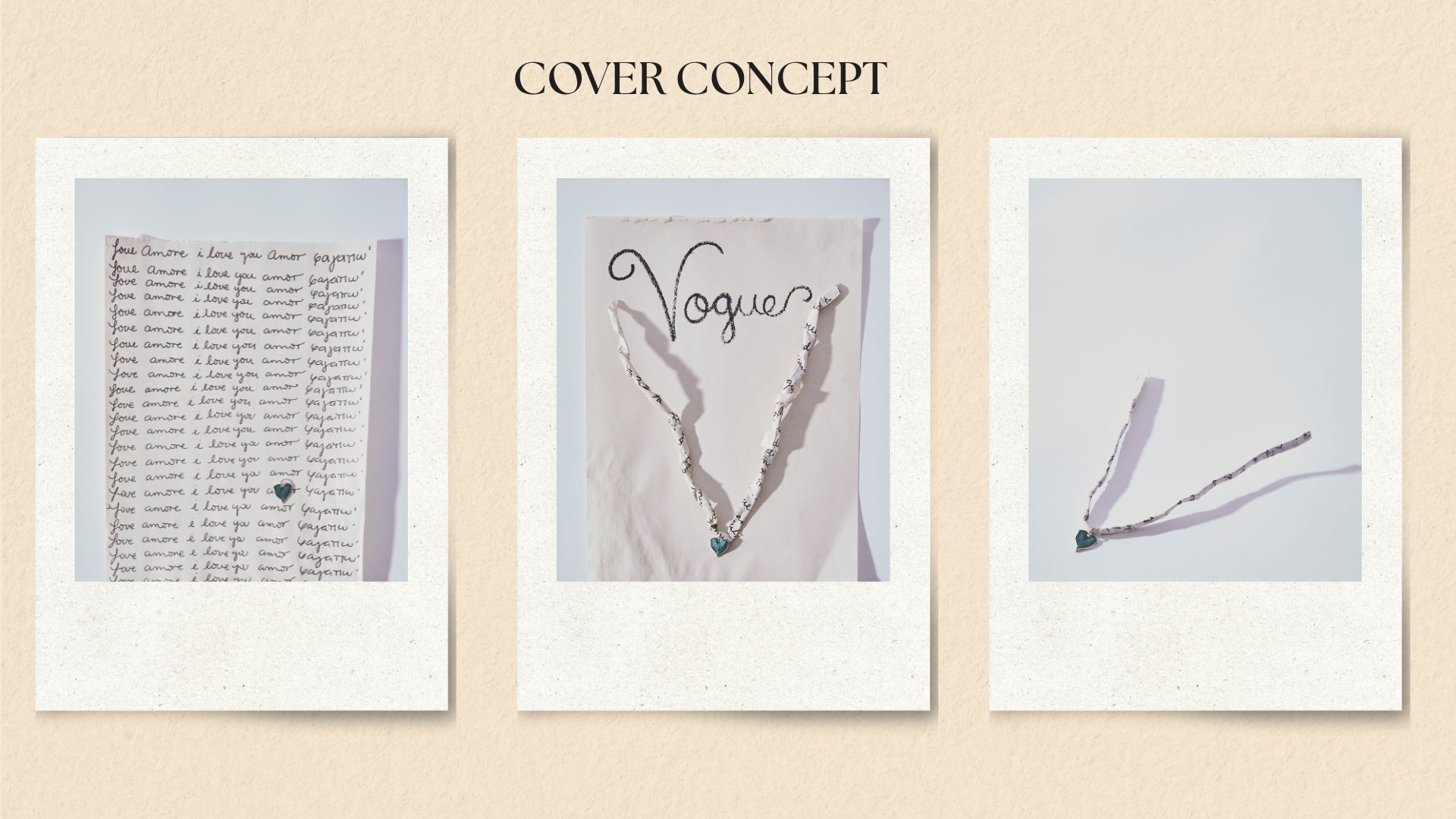
Cover concept:
A LETTER TO CARRY
At its centre sits Fiona Rae’s delicate leaf/heart pendant, embraced by a handwritten letter that becomes its necklace cord. The letter physically carries it — wrapping around the pendant, holding it close and giving form to the invisible feeling it represents.
The handwritten Vogue logo extends this language, deliberately moving away from the perfection of a digital typeface.
The cover is ultimately a portrait of human feeling made physical.
words become jewellery jewellery becomes emotion.
the moodboards.
01 / 04